
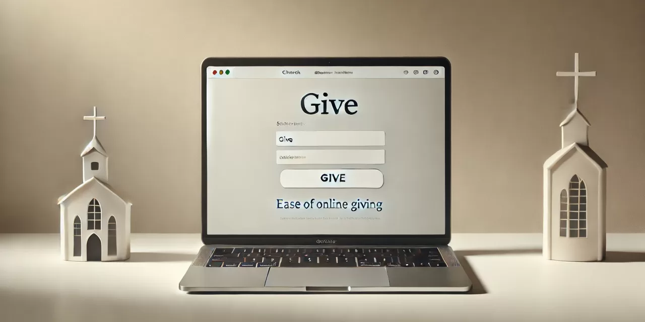
Your Website as a Giving Tool
Imagine a first-time visitor to your church’s website. They’ve just watched a sermon online and feel moved to support your ministry. They decide to give—but after clicking through several pages, they still can’t find a clear way to donate. Frustrated, they give up and leave the site.
Unfortunately, this happens far too often. Many churches unintentionally create barriers to giving simply by not making online donations simple and accessible.
Your church website isn’t just a place for service times and event updates—it’s one of the most effective tools you have for encouraging generosity. When set up properly, it can inspire giving, build trust, and make the donation process effortless for your congregation.
In our previous post on the best church giving platforms, we covered how to select the right system for online donations. But choosing a platform is just step one. If your website doesn’t make giving obvious, intuitive, and compelling, even the best platform won’t be enough.
So, how do you optimize your website to encourage more giving? In this guide, we’ll walk through practical steps to make your giving page easy to find, build trust, and create a seamless donation experience for your church members and visitors. Let’s get started! 🚀
Make Your Giving Page Easy to Find
If people have to hunt for your donation page, they won’t use it. It’s that simple. The easier you make it for someone to give, the more likely they are to follow through. But too many churches bury their giving page deep in the menu or only mention it during offering time, making online generosity more difficult than it should be.
Think of your giving page as a front door to generosity. Just like you want your physical church entrance to be welcoming and easy to access, your online giving option should be just as clear and inviting.
Where Should the Giving Page Be?
For the best visibility, here are a few key places to feature your giving page:
- Main Website Navigation – The “Give” button should be front and center in your menu. Not buried under “About Us” or hidden in a dropdown—make it one of the primary links.
- Website Footer – People naturally scroll to the bottom when searching for important links. Placing a donation link here ensures it’s always visible.
- Blog Posts & Sermon Pages – If you post sermon recaps or inspirational blog content, include a small call-to-action like:
“If this message encouraged you, consider supporting our ministry through online giving [here].” - Announcements & Event Pages – If you’re raising funds for a special cause or outreach effort, include a direct link to donate. Never assume people will search for it on their own.
- Sticky Bars or Pop-Ups – A subtle banner at the top of your site that says “Support Our Mission – Give Online”keeps generosity top-of-mind without being intrusive.
Make It Mobile-Friendly
More than half of all web traffic comes from mobile devices, meaning if your giving page isn’t mobile-friendly, you’re losing potential donations.
Ensure that:
✅ The donation form is simple and doesn’t require unnecessary steps.
✅ The giving button is large and easy to tap on small screens.
✅ The entire process takes less than a minute from start to finish.
A clunky or confusing experience will frustrate people and make them less likely to give. Keep it clean, quick, and easy.
By making your giving page impossible to miss and simple to use, you’ll remove the biggest barriers that keep people from giving online.
Create a Compelling Giving Page
Your giving page shouldn’t feel like a bill pay portal—it should inspire generosity. Too often, churches simply embed a donation form and call it a day, but a truly effective giving page does more than just collect funds—it connects people’s generosity to God’s work.
Think about what happens when someone clicks “Give.” They’re taking a step of faith, investing in your church’s mission. Your giving page should affirm and encourage that decision, not just process a transaction.
What Makes a Great Giving Page?
To turn a simple form into a meaningful giving experience, include:
- A Short, Heartfelt Message – Before asking for a gift, remind people why it matters. A simple line like “Your generosity helps us spread the gospel, serve the community, and change lives” makes a huge difference.
- A Distraction-Free Layout – The page should be clean, simple, and focused. No clutter, no extra links—just a clear path to give.
- Multiple Giving Options – One-time and recurring gifts should be easy to select, along with text-to-give or app-based options if available. The easier you make it, the more people will use it.
- A Clear Call-to-Action – Instead of a generic “Submit” button, use something more compelling, like:
“Your gift fuels ministry—give today!” or “Partner with us in spreading the gospel.”
Making the Experience Seamless
A clunky, complicated donation process will turn people away. The best giving pages remove friction so generosity is effortless. Ask yourself:
✅ Is the page easy to read and navigate?
✅ Does the form load quickly and work well on mobile?
✅ Is the process simple enough that someone can give in under a minute?
When your giving page is clear, inviting, and focused on impact, people will feel more confident and excited about supporting your church.
Optimize Calls to Action (CTAs) for Maximum Engagement
A strong Call to Action (CTA) isn’t just a button—it’s an invitation. The words you use and where you place them can make the difference between someone feeling inspired to give and them clicking away.
Think of it this way: When someone visits your website, they might want to give, but if the opportunity isn’t obvious, they’ll put it off—or forget entirely. That’s why your CTAs need to stand out and be strategically placed to encourage generosity.
Best Practices for Church Giving CTAs
- Use Strong, Action-Oriented Phrases
People are more likely to respond when a CTA is clear, compelling, and mission-focused. Instead of bland, transactional text like:
❌ Donate Here
❌ Submit Gift
Try something more engaging that connects giving to purpose:
✅ Support the Mission
✅ Make an Impact Today
✅ Fuel Kingdom Work
✅ Give to Change Lives - Place CTAs Where People Will See Them
CTAs should be impossible to miss—not hidden in a sub-menu. Some key placements include:- Above the Fold: Ensure a “Give” button is visible as soon as someone lands on your homepage (before scrolling).
- Main Navigation Menu: This should be a permanent fixture in your website’s header.
- Blog Posts & Sermon Pages: If someone just read or watched something impactful, give them an easy way to respond with generosity.
- Footer & Sidebar: Placing a CTA at the bottom of every page ensures visitors always have a next step.
- Encourage Giving Beyond the Donation Page
Many churches limit CTAs to the giving page, but that’s a missed opportunity. Incorporate CTAs throughout your website, especially where people feel inspired or connected:- After a sermon video → “If this message blessed you, help us reach more people by giving.”
- On ministry pages → “Support our outreach efforts by giving today.”
- Event pages → “Can’t attend? You can still make a difference through giving.”
By making giving opportunities visible, engaging, and mission-driven, you create a natural path for people to participate.
Reinforce Security & Trust
Let’s be honest—people won’t give if they don’t feel secure. In a world where online scams and fraud are real concerns, it’s natural for some church members to hesitate before entering their payment information. That’s why building trust is just as important as making giving easy.
Think about it: If someone visited your church for the first time and saw an unlocked offering box in the lobby with a handwritten sign that just said “Put money here,” would they feel comfortable dropping in their tithe? Probably not. Online giving works the same way—people need to know their gift is safe and being used wisely.
How to Build Trust with Online Donors
1. Prioritize Security & Make It Visible
Most people don’t think about website security—until they don’t see it. A small lock icon in the browser bar or a security badge can go a long way in reassuring visitors that their information is protected.
Here’s what you can do:
✅ Use SSL encryption – This ensures that any information entered on your site is securely transmitted (you’ll know you have it if your site starts with “https” instead of “http”).
✅ Display security badges – If your giving platform provides security certifications, display them on your giving page to give donors peace of mind.
✅ Use trusted payment processors – Well-known platforms like Tithe.ly, Pushpay, and PayPal have built-in security features, making them more reliable for donors.
2. Be Transparent About Where the Money Goes
People give more freely when they know their contributions actually make a difference. If they feel like their donation is just disappearing into a vague “church fund,” they’ll hesitate. Instead, connect their generosity to real impact.
Try adding a simple statement near your donation form that says something like:
“Your generosity fuels missions, outreach, and discipleship—helping us serve our community and spread the Gospel.”
Even better? Include real examples of what giving supports:
📌 “$50 helps provide meals for a family in need through our outreach program.”
📌 “$100 supports Bible study materials for new believers.”
📌 “$500 contributes to mission trips spreading the love of Christ.”
This makes giving feel purposeful rather than transactional.
3. Use Testimonials & Impact Stories
Few things build trust better than hearing from real people who have been impacted by generosity. If your church has stories of how giving has helped someone—whether it’s funding a mission trip, providing for a family in crisis, or supporting ministry growth—share those testimonies on your giving page.
A short quote, photo, or 30-second video can make a huge difference:
“When my family was struggling, our church stepped in and helped us. I didn’t realize how much our giving mattered until I became the one in need.” – Sarah, church member
When people see the real impact of generosity, they’re more likely to give—and to keep giving.
Leverage Content to Encourage Giving
Giving shouldn’t feel like a one-time transaction—it should be woven into the life and mission of the church. The best way to do that? Make generosity a natural part of your website’s content.
Think about it—when someone is deeply moved by a sermon, inspired by a ministry story, or excited about an upcoming outreach event, that’s the perfect time to encourage them to take action and support the work of the church. But too often, churches miss these moments by keeping giving separate from the rest of their content.
Instead, your website should seamlessly integrate opportunities to give. Not in a pushy way—just as a natural next step.
How to Incorporate Giving Into Your Website Content
1. Sermon Pages: Connect Giving to the Message
People often leave church feeling inspired by a sermon. But by Monday, life happens—and that inspiration can fade.
That’s why every sermon page should include a subtle but clear call to generosity.
After a powerful message on faith, service, or generosity, add a simple “Support This Ministry” button or a short message like:
👉 “If this message spoke to you and you’d like to support our ministry, consider giving today. Your generosity helps us continue sharing God’s word.”
For sermon videos, you can even add a giving link in the video description so that those watching online have an easy next step.
2. Blog Posts: Tell Stories That Inspire Action
Stories are one of the most powerful ways to inspire giving. That’s why your blog should be filled with testimonies, outreach recaps, and ministry updates that show the real impact of generosity.
For example:
📖 A blog post about a recent mission trip? End with a giving CTA:
“Want to support our next mission trip? Your gift helps send more people to share the love of Christ!”
📖 A testimony about a life changed through your church? Include a note like:
“Because of your generosity, stories like this happen every day. Thank you for making a difference!”
📖 An article on faith in action? Tie it into supporting the church:
“One way we live out our faith is through giving. If you’d like to partner with us in ministry, you can give here.”
When people see real impact, they’re more likely to give—not out of obligation, but out of joy and purpose.
3. Event Pages: Link Generosity to Ministry Efforts
Outreach events, community service days, and mission trips require resources to make them happen. And many people want to support these efforts—they just need to know how.
Make sure every event page includes a way for people to financially contribute by adding a donation link with a simple message:
💡 “Can’t attend but want to support this event? Your gift helps make this possible!”
For special fundraisers, you can even create a dedicated donation page where people can track progress toward a goal (e.g., “Help Us Raise $10,000 for the Youth Ministry!”). Seeing that progress can motivate people to give.
By weaving giving opportunities into sermons, stories, and events, generosity stops being a separate action and becomes part of the church’s everyday mission.
Promote Recurring Giving for Sustainable Support
One-time gifts are great, but if your church is constantly wondering if and when the next donation will come in, it can make planning for ministry challenging. Imagine trying to budget for outreach programs, missions, or even basic church operations when giving fluctuates wildly from month to month.
That’s where recurring giving comes in.
When members commit to automated, recurring donations, it provides stability—allowing your church to plan ahead, expand ministry efforts, and steward resources more effectively.
But here’s the thing: Most people don’t even think about setting up recurring giving unless they’re invited to do so.That’s why your church needs to make it easy, visible, and compelling.
How to Encourage Recurring Donations
1. Make It Effortless
If setting up recurring giving takes more than a few clicks, most people won’t do it. Make sure your giving platform has a clear, simple option for recurring donations—ideally with a checkbox or toggle that says:
✅ “Make this a recurring gift”
Even better, place this option before the submit button so people see it before they complete their donation.
2. Explain Why It Matters
Many people don’t realize how much their consistent giving helps the church. So, tell them! Use messaging like:
📢 “Recurring gifts allow us to plan outreach, fund missions, and support ministries all year long.”
💡 “Your ongoing support helps ensure we can continue sharing the gospel and serving our community.”
You can also highlight the predictability factor—just like people set up recurring payments for streaming services or gym memberships, a recurring tithe makes generosity a consistent part of their faith journey.
3. Offer Small Incentives (With a Big Impact)
People love feeling included and appreciated. While giving should never be about rewards, you can offer simple incentives to encourage recurring donations.
For example:
🔹 Early Access to Ministry Updates – “Recurring givers get exclusive updates on how their gifts are making an impact.”
🔹 A Special Thank-You Message – Send a personalized email or video message from the pastor thanking them for their commitment.
These small gestures make people feel valued and connected to the mission, reinforcing their decision to give regularly.
Recurring giving isn’t just about making donations easier—it’s about creating a culture of generosity that sustains the church for the long haul.
Track, Test, and Improve Your Giving Experience
Setting up online giving isn’t a “set it and forget it” process. Even if your church has a great giving page, there’s always room for improvement. The easier and more intuitive the experience, the more people will feel comfortable using it.
So how do you know if your online giving is working well? You track it.
Start by looking at how many visitors land on your giving page compared to how many actually complete a donation.If a lot of people visit the page but don’t give, there might be something confusing or discouraging them from following through. Maybe the donation form is too complicated, or maybe they’re unsure about security.
You can also pay attention to which calls to action (CTAs) are getting the most clicks. Are people responding more when you use phrases like “Support the Mission” rather than “Donate Here”? Small wording tweaks can make a big difference.
It’s also worth asking for direct feedback from donors. A simple survey or casual conversation can reveal what’s working and what feels frustrating. If multiple people mention the same concern—like trouble navigating the form or a lack of giving options—it’s a sign to make adjustments.
Testing different layouts, colors, or even button placement can also help. A/B testing—where you try two different versions of a page to see which one performs better—is a simple but effective way to refine your giving experience over time.
At the end of the day, your goal is to remove any obstacles that might be stopping someone from giving. The more seamless and reassuring the experience, the more likely people are to embrace online generosity.
Small Tweaks, Big Impact
Your church website is more than just an online hub for service times and announcements—it’s a powerful tool for encouraging generosity when set up the right way. With just a few thoughtful adjustments, you can create a smoother, more inviting giving experience that encourages both first-time and recurring donations.
If you haven’t reviewed your church’s online giving setup in a while, now is the time. Ask yourself:
- Is our giving page easy to find?
- Are we clearly communicating why generosity matters?
- Does our donation process feel simple, secure, and inspiring?
Even small tweaks—like refining your calls to action, optimizing for mobile, or showcasing impact stories—can make a big difference in how people engage with giving.
If your church hasn’t yet integrated a digital giving platform, check out our previous post on The Best Online Giving Platforms for Churches to find the right fit. Stay tuned for more insights on church growth, digital outreach, and effective giving strategies—check out more of our content to keep your ministry thriving!
Need help optimizing your church’s giving experience? We’ve got you covered.
📩 Download our free guide, “7 Church Marketing Mistakes (And How to Fix Them),” for practical insights on increasing engagement and generosity.
Or, if you’d like personalized guidance, reach out for a consultation, and let’s create a giving strategy that aligns with your church’s mission!


